
Every year, over 5,000 retiring teachers have their single most important interaction with the Ontario Teachers' Pension Plan (OTPP) as they apply for their pension online.
Only 30% were completing their retirement journey without assistance, falling well short of OTPP's digital self-service goals.
As Manager of UX & Creative, I led a cross-functional initiative that, through UX enhancements and email automation, increased self-service completion by 33% and reduced inbound calls by 30%. It's had a positive and lasting impact on member experience and operational efficiency.
OTPP's member portal serves over 340,000 working teachers and pensioners. Over 5,000 of them retire each year. On average they are 59 years old and have been teaching for two decades or more.
While excited to retire, they're often uncertain about what to expect. They intend to apply online, but the irrevocable decisions the application requires leave many feeling they need support. More than anything, they want transparency and reassurance, not just a form to fill out.
As project lead, my role spanned strategy, alignment, and delivery. I was not the hands-on designer, but I shaped the direction, coached the team, and kept the work connected to the business goals.
I led the UX improvements to the member portal and the implementation of event-driven status emails, working in close collaboration with the Manager of UX Content Strategy, who led the educational email journey delivered after application approval.
I coordinated across UX, Communications, Insights & Data, Product, Operations, and the Contact Centre, refined the approach with stakeholders, built the business case, and secured sign-off.
Throughout delivery, I supported the UX team, kept the work on track, and presented results to senior leadership.
We drew on three sources to understand where and why the experience was breaking down:
Together, they let us prioritize with confidence, focusing on the moments most likely to break trust or trigger a call.
With only a few months before retirement season, scope and sequencing were critical. Each solution touched multiple teams: from the team building the status triggers, to those implementing the automated emails and updating the member portal. Coordinating across product owners was essential to keeping delivery on track.
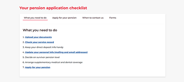
High application abandonment
Analytics showed members were frequently abandoning the application at the first step but would complete it successfully on a later attempt, suggesting they were arriving unprepared. A checklist existed on the public site, but members weren’t seeing it at the moment it mattered. We added it directly before the application’s first step, reducing drop-off and the need to restart.
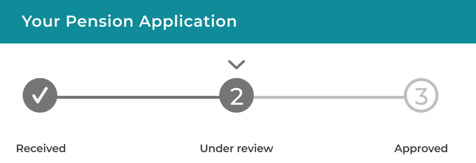
Uncertainty about application and document status
Members who applied online were frequently calling in seeking updates. We added progress trackers to the pension application and document uploader, and introduced status emails at each stage of the application and document review process, giving members visibility without needing to call.
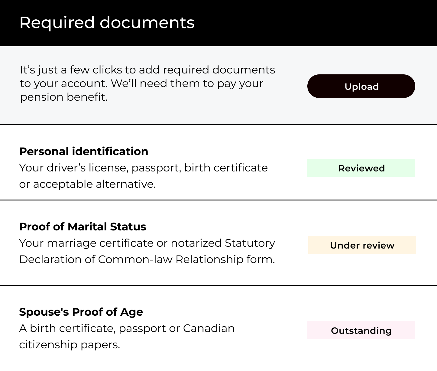
Manual document follow-up
Staff were manually emailing members about missing documents, then managing the replies, a time-consuming process that also slowed application approval. We replaced it with automated reminders triggered by document status, prompting members to upload what was needed without staff intervention. Documents arrived sooner and approval times improved as a result.
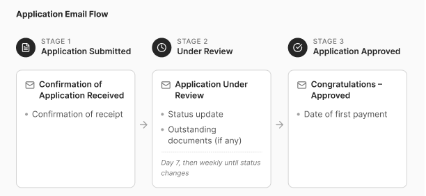
Anxiety during the waiting period
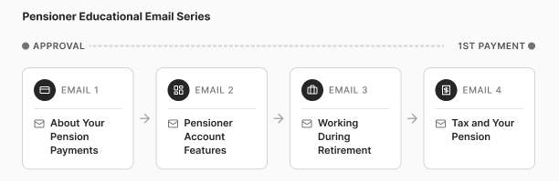
After approval, members faced a waiting period before their first pension payment, prompting many to call for reassurance about what came next. We launched an educational email series throughout this period, proactively answering the questions members were calling about.
40% of retiring members completed their journey entirely within the self-serve digital channel, up from 30% the year before.
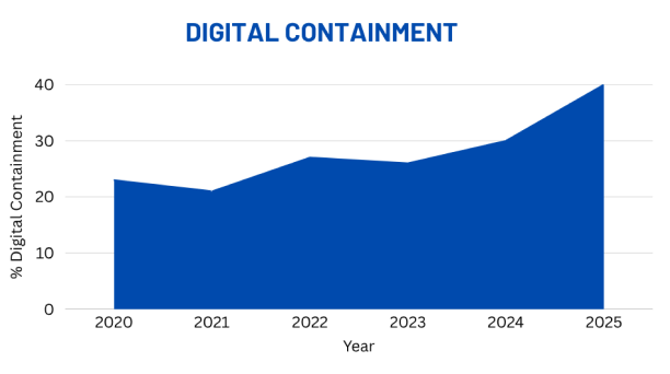
The 2024 initiative delivered the largest single-year increase in digital containment on record. The self-service gains have had a lasting impact on both member experience and operational efficiency.
Communicate constantly across streams.
Because enhancements touched both front-end experience and back-end workflows, keeping all Member Services teams informed throughout, not just at milestones, was essential to avoiding surprises at launch.
Separate the manager hat from the project lead hat.
Leading the project while managing the UX team required deliberate distance: close enough to support and coach, far enough to keep strategic priorities in focus.
Embed data expertise early.
Bringing the Insights & Data team in at the start helped us prioritize the highest-potential features, and meant we could report credibly on outcomes after retirement season closed.
