Munich Re
2016 - 2022
Leading UX and marketing for Parachute Insurance
Foundations
Preparing to revolutionize insurance
Parachute's promise was simple: fast, self-serve insurance, from quote to active coverage in under 10 minutes. Delivering on that promise was anything but. We were digitizing a paper-heavy, broker-led process while building a white-label platform serving B2B and B2C audiences, all within strict regulatory requirements and across multiple jurisdictions.
Key design requirements
A flexible architecture
White-label platform accommodating products from multiple insurance carriers
100% digital B2B
End-to-end insurance solution for carriers, brokers, and employers
100% digital B2C
Self-serve product education, digital underwriting, and instant coverage activation
Product-specific e-commerce sites
Consistent UX across life, health, and commercial products
Co-branded campaigns
Build trust in the new Parachute brand through co-branded emails and storefronts
A unified member portal
Self-serve management of coverage and claims for multiple products
UX Strategy
Leading UX design for a low-friction experience
I directed an external UX agency to design the new e-commerce platform, providing product requirements, shaping research plans, and reviewing all UX artifacts.
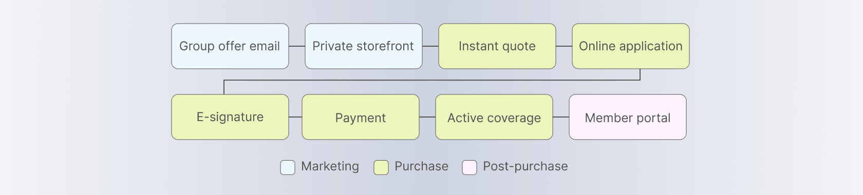

End-to-end user journey

Personalized email linking to a storefront with pre-filled quote calculator fields
Tailoring storefronts for each new product
We launched in 2017 with two products, Parachute Life and Parachute Critical Illness.
I led the team creating marketing materials for B2B and B2C audiences, ensuring adherence to the Parachute brand across bilingual UI copy, marketing emails, landing pages, video scripts, and ads. I also ran LinkedIn campaigns for B2B audiences and managed Google Ads across search and retargeting, owning keyword strategy, bid management, and budget allocation.
For each new product, we created storefronts with distinct colour palettes and imagery tailored to its intended audience. Across all products, we turned complex policy details into easy-to-understand UX copy while complying with strict regulations. We also co-branded emails and storefronts with each employer group's logo, lending credibility to a brand members were encountering for the first time.

Storefront home page views of Parachute Term Life and Cyber Insurance
Designing for consistency and conversions
I worked with the agency to design a shared UX for the transactional screens, with steps dynamically adapting to each product's requirements and the customer's selections. Presenting family coverage options during the purchase flow encouraged customers to cover multiple family members in a single transaction.

Example of transactional screens for a product requiring a spousal e-signature
With more products to offer, we incorporated cross-sells into our UX strategy, across emails, storefronts and the member portal. We also added cart abandonment emails to re-engage members with a saved quote, prompting them to complete the purchase before their offer expired.

Example of a multi-product email and a cross-sell module displayed during the checkout flow
Retrospective
Results
An evolved insurance marketplace
By 2022, I had grown into the role of Director, UX and Marketing, producing design work in-house and helping evolve Parachute into an end-to-end insurance marketplace supporting both personal and commercial lines.
We had expanded our offerings from 2 to 5 insurance products, each time absorbing complexity without compromising the experience Parachute was known for: fast, simple, and fully self-serve.

Parachute Life Insurance storefront on mobile

Member Portal offering coverage management, claims, and additional products
A faster path to coverage
For customers used to insurance sites that provided online quotes but required dealing with brokers, lengthy forms, and medical tests to finalize a purchase, Parachute was a breath of fresh air.
We digitized the entire insurance-buying process through a carefully orchestrated journey, from personalized emails to instant quote and active coverage in under 10 minutes.
The simple, cohesive, and low-friction experience drove conversion rates 5x the industry average.
Taira joined our Parachute B2C project in its early days and wore many hats as we laid the foundation for a global project and built our pilot websites. Her guidance on all things UX and SEO, attention to detail, and open collaboration style were instrumental to our successes.