Munich Re
2022
Produced UX deliverables from concept to high-fidelity: Term Life insurance product
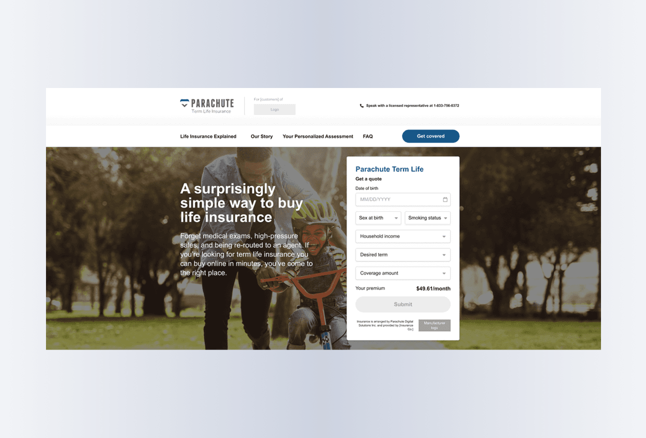
Term Life home page with quick quote calculator (Figma)
Low-fidelity
From whiteboarding to wireframing
We kicked off with whiteboarding sessions alongside the product owner, business analysts, and insurance SMEs, reviewing the existing product experience and mapping requirements for the new one. Working alongside the other UX Director, we produced low-fidelity sketches and clickable wireframes, documenting rules and logic as we went.

Key differences identified during whiteboarding sessions (InVision)
Three areas required new design solutions:
1. Quote calculator
Term Life required two additional fields to generate a quote. While the mandate was to minimize UI changes, some modifications to the homepage calculator were unavoidable.

Calculator with additional fields and logic notes (wireframe)
2. No family coverage
Term Life was the only Parachute product without spousal or family coverage. Rather than simply removing the option, we designed a feature that allowed users to invite their spouse to apply for their own individual coverage.

Spouse invite feature (wireframe)
3. Medical questionnaire
To avoid overwhelming users, we designed the questionnaire to show only top-level questions by default, with reflexive follow-ups appearing based on each user’s answers. When our preferred indented layout was ruled out due to system constraints, we colour-coded follow-up questions as an interim solution and flagged our preferred approach for a future phase.

Colour-coding solution for reflexive questions (wireframe)
High-fidelity
From wireframing to high-fidelity mockups
With wireframes approved and feasibility confirmed by developers, we divided the screens and produced high-fidelity mockups in Figma.

Desktop and mobile UI designs for the quote page (Figma)
I designed desktop and mobile versions of the Term Life home and marketing pages. I also ensured the transactional steps remained consistent with the broader platform.
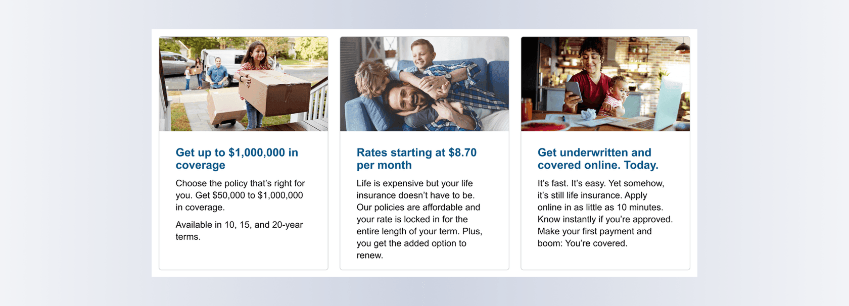
Detail of home page design (Figma)
Retrospective
Results
All UX artifacts, from wireframes and high-fidelity designs to English copy and French translations, were delivered before each development sprint began, giving developers the clarity they needed and keeping the project on track.
Working directly in Figma alongside developers and stakeholders meant feedback was incorporated in real time, reducing the back-and-forth that had slowed previous projects.
Bringing UX in-house proved faster, more collaborative, and better suited to an agile environment, with meaningful savings in both cost and turnaround time.
Term Life launched on schedule and on budget, without compromising the speed and simplicity the platform was known for.
Taira has the experience and skills to be a solid leader for any UX, design and marketing team. Being eagle-eyed in details, methodical, organized and thorough, Taira led multiple UX design and marketing projects with finesse. Hard skills aside, Taira brings an incredibly calm, level and capable aura through teamwork and leadership in her collaborations with various stakeholders, teams and vendors.